
fenway health redesign
UX/UI mobile website design
Project Overview
Fenway Health is a health clinic located in Boston, MA that focuses care for the LGBTQIA+, BIPOC individuals, and underserved communities. They strive to be accessible, supportive services, and transformative research.
This project involved reviewing a RFP, research, site organization, and visual design. The end goal was to redesign their mobile website to be more user-friendly through simplified navigation while having a brand to stand out against competitors .
Client
Fenway Health (concept)
My Role
UX/UI Designer - Solo
Discovery
(-ε- )
Discovery (-ε- )

goals
Functional and fluid interaction
The homepage is currently very cluttered and the navigation can be confusing with all the options. This needs to be simplified to make the navigation easier.
Hierarchy on interface
Important things need to be the first things in the navigation and homepage (such as booking appointments, insurance information, etc.), not blog posts or upcoming events.
Distinguish us from competition
The branding is similar to competitors in terms of color and the logo does not stand out. I would push the LGBT care since that is where they stand out the most.
Contact/support
There should be a chat feature (as they requested) to help people navigate or answer questions not found on the website to get the most support as they can.
competitor analysis
Looking at the competitor analysis we can see how other competitors can they all have simpler layouts on the home screen compared to Fenway Health. We can also see that the competitors have a better sense of their audience. Once you get on their website it is clear who they are providing care for, Fenway Health needs to push more on their home screen their care for LGBT people.
Research
(・ω<)
Research (・ω<)
heuristic evaluation
Help & documentation
Did not run into anything too complex that I needed help with. I can see how some information is lost or hard to find due to the drop down menu, also needs more options for people that do not have MyChart.
Could add a chat bot
Aesthetic & minimalist design
The home page is very clustered with repeated (translation and MyChart options come up multiple times on the home page) or not important information (blog post and events are on the homepage instead of scheduling an appointment, which is arguably more important).
Put the most commonly visited pages on the home screen
Error prevention
There is no way to book online other than logging into a MyChart account. Must get confirmation there. There is a pay as guest option but it does not work. When clicking on a new option on the website to take you to another internal page, it opens a new tab.
Allow booking without MyChart
Consistency & standards
The use slightly different wording than common words than more common ones as mentioned before in the scheduling for appointments. Also, for insurance they only say the United Health Care is the one that they do not accept all plans. I want to know if that is true, and they do not list other types of insurances like vision when they have a vision department.
Allow to book on the same page as finding a provider, use the same wording, etc.

John Smith, 60, Boston MA
Retired
Tech Savviness
4/10
Background & Notes
An immigrant but fluent English speaker. A father of 3 children. He is retired, but worked in the union as a flooring foreman. Checks phone in free time, but mainly watches the news on his TV. Sees multiple care providers due to multiple health concerns, so he is looking for specialized care.
Recommendations
MyChart access, simple layout, access to patient records, locate insurance information, see offered services, read information on the doctors with contact linked
user persona
User Testing
⊂(▀¯▀⊂ )
User Testing ⊂(▀¯▀⊂ )
site mapping
Navigation of Fenway Health used in user testing
tree testing - tasks
Locate: Billing & Insurance
70%
Locate: Internal Medicine
Navigation of Fenway Health modified after user testing
directness rate
60%
success rate
overall score
5/10
success rate
50%
directness rate
40%
overall score
3/10
user flow
User flow map of a user navigation from the home screen to locating a provider’s information/contact page

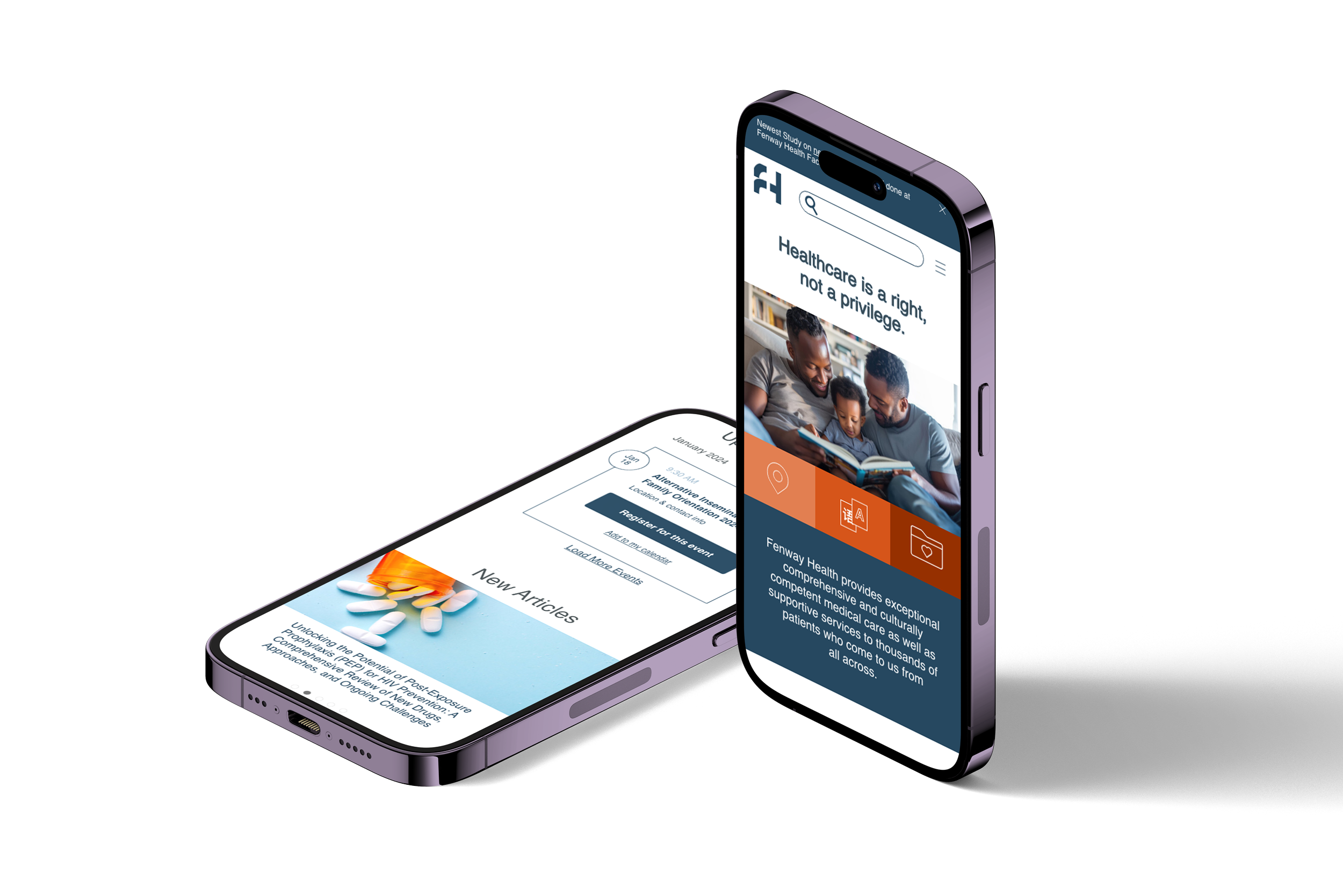
Final Design
<3
Final Design <3

