flixster redesign
UX/UI app design

Project Overview
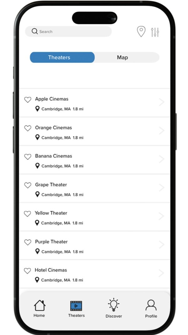
Flixster is a movie theatre app owned by Fandango that allows the user to order tickets, buy movies for at home, and read articles about the film world.
For this project, I was given the task to redesign the Flixster app to be more user-friendly and more branded. This project will explore research and design.
Client
Flixster (concept)
My Roles
UX Researcher - Team UI Designer - Solo
Research
( ͠° ͟ʖ ͡° )
Research ( ͠° ͟ʖ ͡° )
initial findings
Visual Hierarchy
I feel like this can be stronger, especially on the news page. All of the articles are the exact same format and stretch across the whole page.
You start by seeing all of the movies that are streaming in theatres, helping the user quickly accomplish their goal - reducing cognition load.
Clicks Used
It takes about 7 clicks to purchase a ticket for a movie.
Accessibility
I do not believe that the navigation is ADA-compliant. The gray on top of the medium blue color could be very difficult for people to see.
Icons have words associated with them to make the meaning clear to the user.
Motivations
Create a Fandango account to get their benefits.
Form Follows Function
Options are highlighted when you are on that page (bottom navigation becomes white when on a selected screen, top of the page moves if you select “In Theatres” or “Coming Soon”).
Everything that presents as a button is in a highlighted color (blue) to show it is intractable (gray if not yet interacted with).
If you click on blue text, it give you a default pop-up telling you more information about what the text means.
When you click call it brings you a pop-up on your phone to be able to call the location you wish to visit to see a movie.
No autofill on the search bar.
Aesthetic
The main color palette is gray, white, and blue. For a movie app I would expect some more excitement, but it comes across very minimal and professional. The color palette almost reminds me of a medical app, rather than a movie one.
Some of the layout feels outdated because it is so plain, like the news tab.
The pop-ups and loading screens are default, adding to the feeling of plainness.
Struggles
The news pages lacks a search bar which I feel could be helpful if one wanted to learn more about a specific movie.
When you search for actors in the ‘At Home” page, there is no photo associated with it despite there being a space for it. Instead, there is a grayed out image of a popcorn bucket.
“My Account” is repeated twice when you go to settings.
Consistency – The settings icon is smaller than the other icons.
Emotions
Neutral, due to the aesthetics.
Happy with navigation, seems very straight forward.
Control
There is a popup to confirm with the user if they want to leave the page for purchasing tickets when in the middle of the process.
The app feels pretty intuitive due to its limited navigation. It also sticks closely to the meaning of the app, solely focusing on the one goal of allowing the user to buy movie tickets.
There is not too much cluttering to distract the user, only some ads that come across the page from time to time.
Style Guide
ᇂ_ᇂ
Style Guide ᇂ_ᇂ

Flixster Jelly Bean
#2573B6
-
While I could not find exactly what Flixster uses as their type. By looking at it, it appears to be Proxima Nova. I think this typeface is fine and readable. A san serif in this case I think would be more appropriate than serifs since they tend to give a more professional feel. Bold can be used as headers and buttons, while italics can be used for hyperlinks. Regular can be used for paragraphs.
Accent Color
Orange Creme Soda
#FF8000


-
I wanted to keep the buttons playful, so I kept their rounded shape, with using the main color palettes to indicate their intractability.
Navigation Color
Light Gray
#F0F0F0
Background Color
White
#FFFFFF
-
I picked out the blue that Flixster uses as main color. I used an orange as the secondary color to stick to add a complimentary color palette that will emphasize the main blue, as well as, to show intractability. The addition of orange will make the app more bright, which we want to promote playfulness since they are an entertainment app. Then added some neutral colors to balance out the palette and keep it minimal.
-
I think real color images would fit the app best to relate to the user and show the situations they can be in by using the app. I like the icon on the app that relate to movie theater like their film icon, I believe these should stay to show personality and function of the app.
Main Color

Final Design
<3
Final Design <3


